Emoticons run high: Rosie Popka on designing for MOUTHY
In March, artist Rosie Popka (Camberwell UAL) produced some fantastic work as part of a project in which we briefed Camberwell students to design and pitch a lead image to us for our forthcoming season MOUTHY. Here, Rosie writes about designing for the MOUTHY brief and discovering the mouth: a functional device and an expressive device.
The mouth is a vast and varied subject to create art from. As I have learnt from my Mouthy research, there are many many different aspects to the mouth, and it is a fantastically complex feature most creatures in some form or another have in common. But for my Mouthy project, I wanted to concentrate on the human mouth in all it’s quirks and glory.
To begin, I reduced the functions of the mouth to their basic qualities to help me understand better what the mouth was all about. In the human mouth, these main functions are –
EATING
BREATHING
TALKING
and being used as an EXPRESSIVE DEVICE.
I saw a clear division within these functions- with eating & breathing being fundamental to bodily functions and talking & expressions being imperative to the social side of human wellbeing. So, I first looked at the biology of the human mouth. This research, as I’m sure you can tell from my sketchbook images below, is not accurate in it’s proportions or colours, but simply illustrates the forms within our mouths for my better understanding.
Sketchbooks and diagrams
I then began looking into the mouth as an expressive device, and this is where things really began to take shape for me in terms of the direction I wanted to take my research in. My next task was to understand human emotions, and look at the six basic areas we can express (I know there are a heck of a lot more, but I wanted to keep my research as un-sprawling and tight as possible!).
The six emotions
To take the expressions route further, the idea of singling the mouth out of the human face and looking at it as it’s own expressive device interested me to no end- I wanted to know if you could tell a person’s mood or expression just by looking at an image of a mouth with no other clues from the rest of the face. From this idea I came up with a small experiment to see if we can tell someone’s mood just from their mouth. I picked a film with a wide range of expressions, screen shot good images and cut the mouths out- then asked my participants to choose from the list of the six main emotions as to which they thought each mouth fit. The film I chose was Alfred Hitchcock’s Psycho. Below are some of the results of my experiment:
I found that often emotions cannot always be pinned to just one of the expressions.
I also found that the mouth, when singled out from the face, is often very subtle expression-wise and hard to read.
But that’s not always the case!
I was happy with where the expression side of the mouth was taking me, and I decided that I wanted to, for a possible final piece, concentrate on the six areas of expression and create a varied range of mouths from what I’d learnt in my research. I was heavily inspired by Bruno Munari’s faces at this point, and I also wanted to keep my mouths as simplistic, iconic and memorable as he had achieved with his ink faces.
Faces by Bruno Munari
I thought with my next step it should be important to research more into logo design and looking further at what makes an iconic image. I came across this wonderful book on French Art Deco logo designs, with the images inside all very geometric, simple and effective (much like Munari’s faces).
French logo designs
At this point I found that I was concentrating far too much on the design of the image and not enough on what it was that I wanted to make. Was I still running with the varied mouth idea à la Bruno Munari? I needed to look again at what I knew to be an ‘expressive device’.
And then it hit me- what combined simplistic design, expressiveness and popularity amongst everyone?
THE EMOJI!
This was a real breakthrough moment for my Mouthy project.
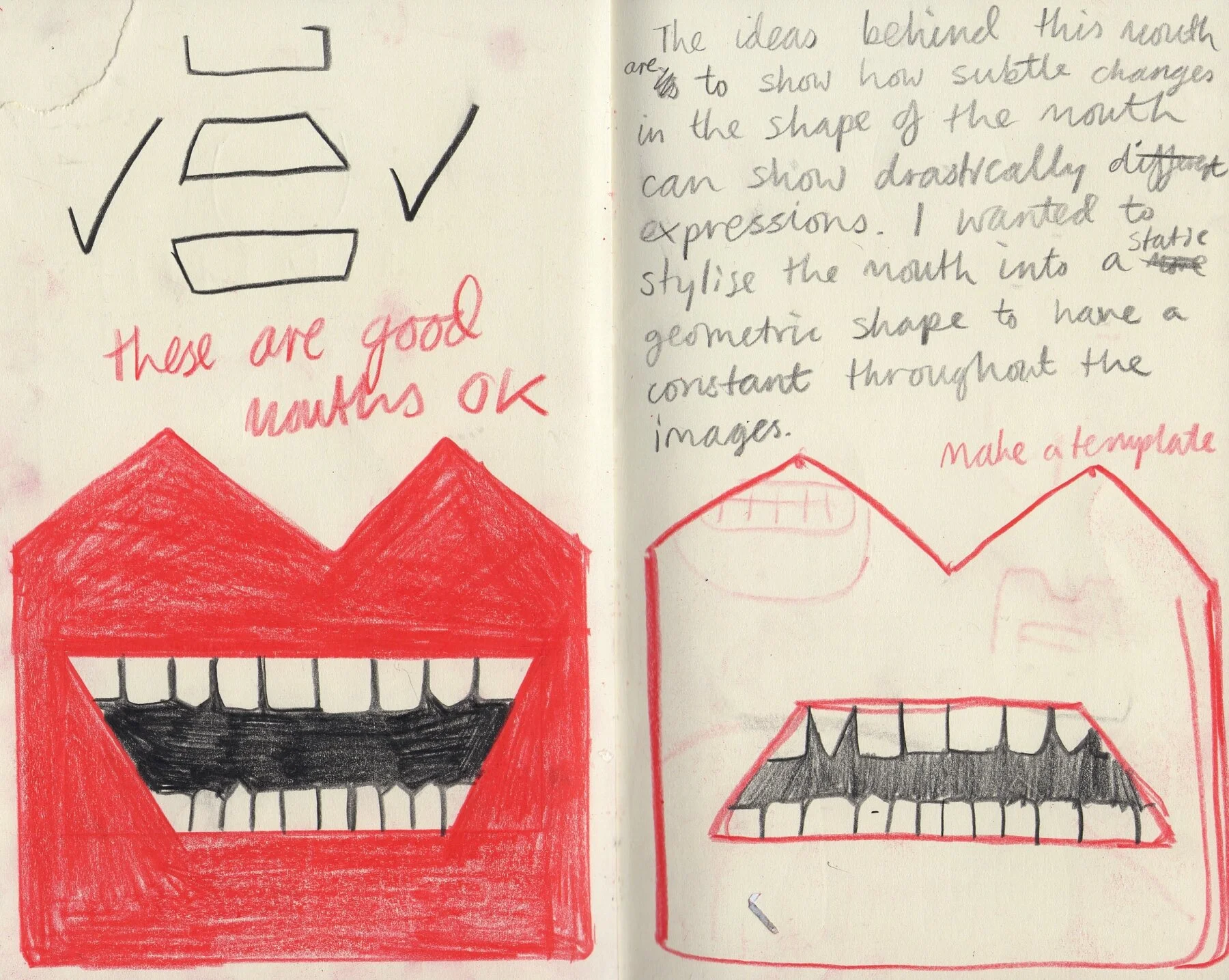
At this point I went back to basics and began playing around with simple mouth designs – incorporating ideas I’d had from the six emotions, the emojis I’d seen as well as the French Art Deco logos (which are two things I honestly never thought I’d be comparing or bringing together!). Below you can see my development pages from this point to the final piece.
Pages above: working out my design and playing with ideas, I found the square geometric design and ran with it!
Above: paper cut-out designs of 3 mouth expressions. I decided that six emotions may be too busy for the final design & stuck to anger, happiness and fear.
Colour pencil pixelated versions of the mouths, I really really liked these. They showed a subtle change to the mouth while keeping the lips the same.
The final design! I kept the pixelated-ness but made it digitally instead.
And finally: as a GIF!


